With a brand new look and many fresh features, the Photos App has received a complete overhaul in Windows 11. Here is a guide on how to navigate the transformed interface.
Even within this OS, there is a big difference between certain versions of the Photos application. The 22H2 update brought a slew of major changes, transforming its interface and features. It also introduced Clipchamp into the suite of Windows applications, giving you access to a more powerful, more streamlined video editor than the default Photos editor.
Table of ContentsWhat’s New in the Windows 11 Photos App?The most obvious difference in the new version of the Photos app – or rather, in every aspect of Windows 11 in comparison with Windows 10, really – is the revamped interface. The windows look different, the button layout has been altered, and many options are placed in different locations than before.
Overall, the look achieved is cleaner and more aesthetic than before. Most of the options you need are still there, just in a more streamlined form. In many ways, the UI mimics the graceful simplicity of Apple, and it’s not a bad thing.
Opening a Photo From the File Explorer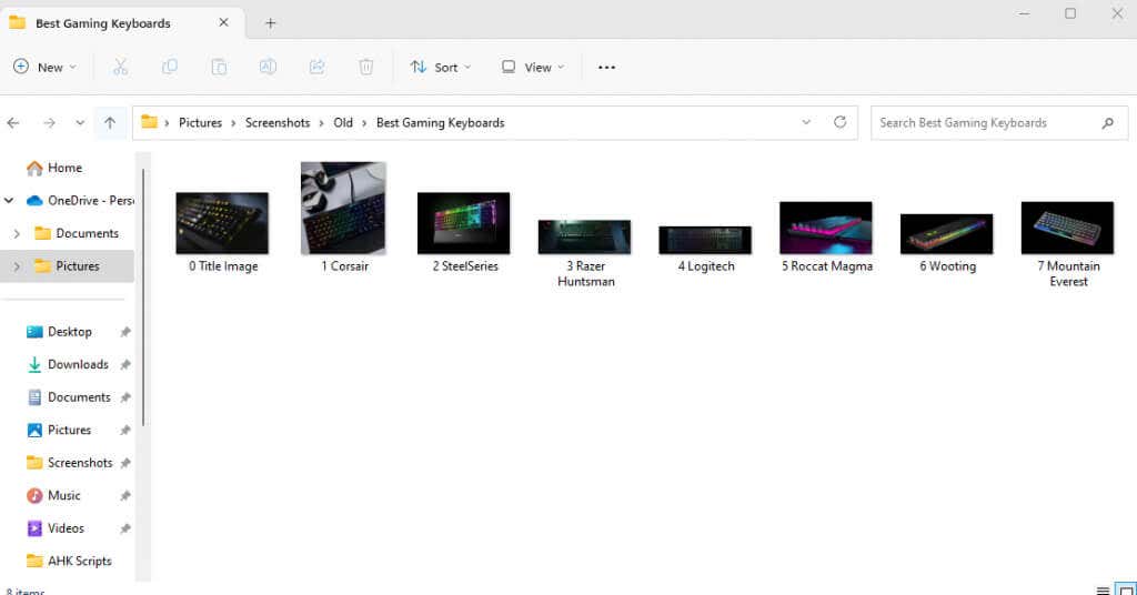
There are two ways to get to the Photos app—opening the app directly, or just double-clicking a photo on your PC. Unless you have modified your defaults, this will open up the picture using the Photos app, giving a more minimalistic window than the one you get with the full app. Here are some features of this view:
A Vanishing ToolbarWhen you open a photo directly from Windows Explorer, the toolbar will show up over the picture. Clicking anywhere on the photo will make it disappear, but you can always click again to bring it back.
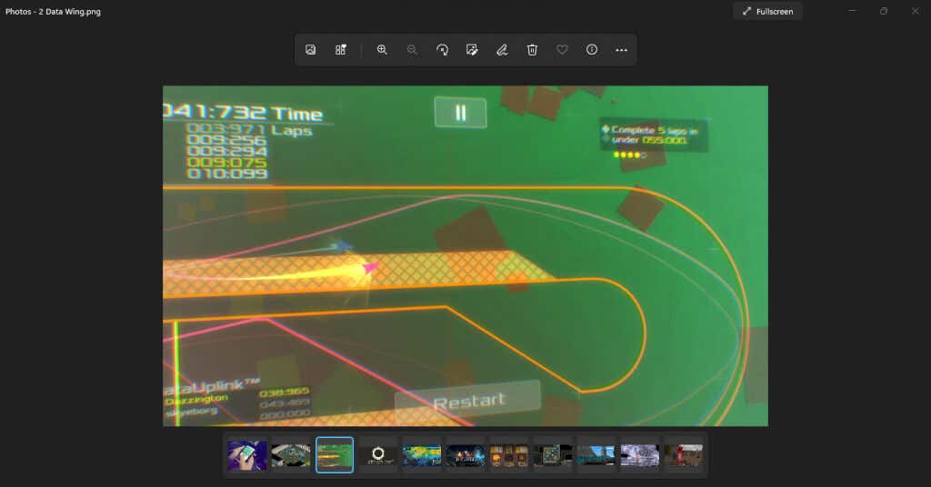
Coming to the toolbar itself, the streamlined approach of the new Windows 11 is apparent here as well. You will only see a small selection of the most commonly used options represented by the new icons.

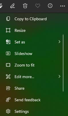
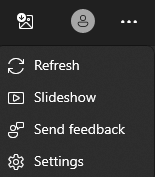
Don’t worry, though. The rest of the options are still there. Click on the Three dots at the end of the toolbar to bring down a menu containing the missing options, including things like Resize, Slideshow, and even Settings.
 Film Strip
At the bottom of the Photos app, you will spot a ribbon of images. This Film Strip lays out all the pictures in the current folder, letting you switch between them easily.

Keep in mind that the film strip only displays photos in the current directory, not your whole device. For a more powerful way to view multiple images, we can use the Albums feature.
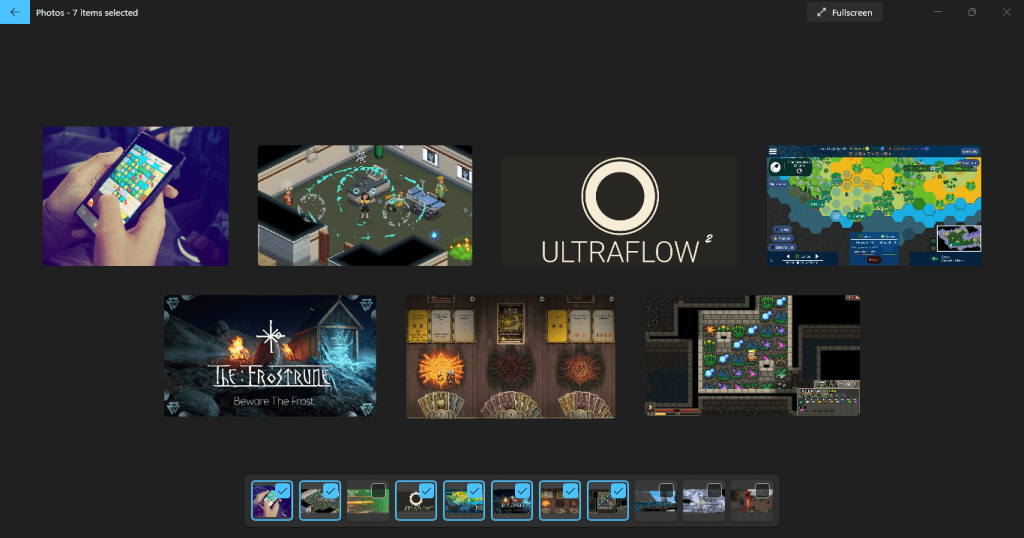
Collage ViewBetter yet, you can select multiple photos from the film strip, which displays them all at once in a collage view of sorts. To do this, simply take the cursor to the corner of the image tile in the film strip and enable the checkbox.

You can freely select and deselect images through this method, shuffling the collage around to compare the photos. The only drawback of this method is that it is limited to the images in the current folder.
 A More Intuitive Gallery
The default gallery view you get upon opening the Photos app sports a different look as well. Called Collection, this tab displays all recently opened photos, sorted by the date as before.
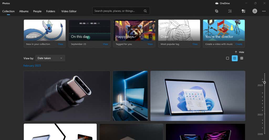
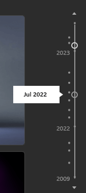
At the top are a few highlighted collections, throwing a spotlight on things like recently accessed pictures or photos clicked on the same day. On the right is a date slider you can drag down to take a trip down memory lane and access older photos.
You can also click at various points of the slider to display pictures of a particular month, which is useful to hunt down photos saved on specific dates.
 Making Sense of the New UI
We have already taken a look at what the Photos app looks like when opening, but let’s understand the elements on the screen one by one.
The top bar, to begin with, is where most of your options to navigate the app are located.
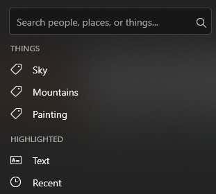
On the left are the various tabs we will discuss in their sections. Then you get the Search bar, which is handy for finding photos by a specific name or even tag. Of course, this is more useful to people who have a naming system or tag their photos properly.
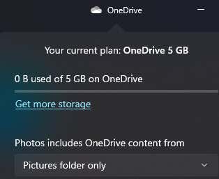
After that, you can spot the OneDrive icon on the right, helping you access the pictures in the OneDrive cloud storage.
Below that is a series of buttons: New, Select, Import, and Account.
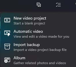
The first one lets you create a new video project or album.
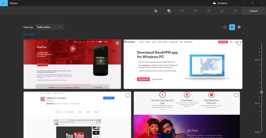
Select lets you, well, select multiple photos from your Collection.
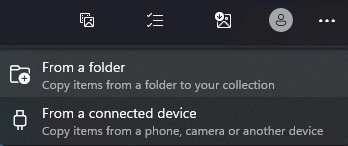
The next button is for Importing folders not in your collection, from your PC or even an external hard drive.
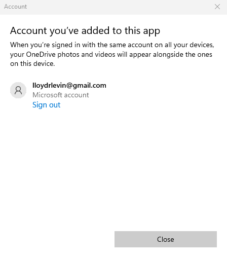
The account button is just for managing the Microsoft accounts linked to your app.
Finally, you have a three-dot icon to bring down a small menu containing more options such as Slideshow and Settings.
 Organize Photos with Albums
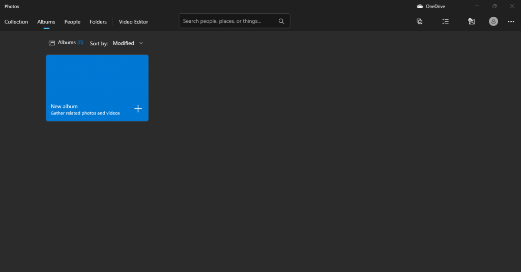
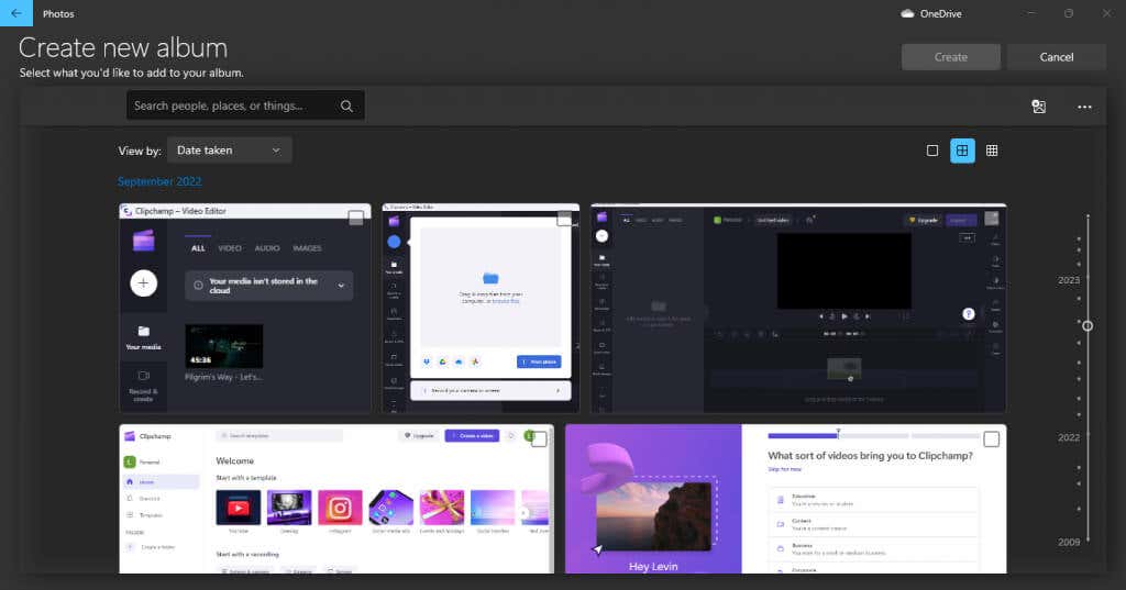
The second tab in the Photos app is Albums. As the name suggests, this gives you the ability to create your own photo albums, freely adding and removing pictures as needed.
They don’t even have to be from the same folder – you can create albums organizing photos located anywhere on your PC, or even OneDrive. Of course, you will have to import them into your Collection first.
 People
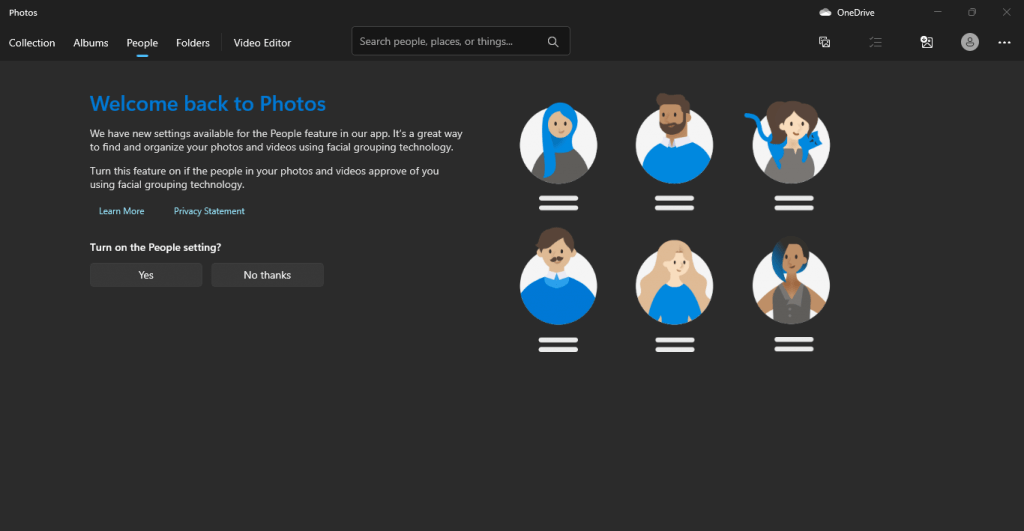
This tab can organize your photos by people, letting you make sense of large photo albums easily. And don’t worry, you don’t have to manually tag every photo – the app will use an image grouping algorithm to automatically sort the photos by the people in them.
But not all people are comfortable having their photos tagged like this, so only do this if you have the consent of the persons involved.
View All Pictures on Your PC with Folders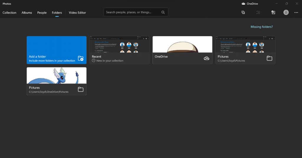
The Folders tab lists out entire directories containing photos in one place. By default, this includes OneDrive as well as the Pictures folder, though you can add any other folders as well.
In some cases, this can make this tab a better tool to view all the pictures of your computer than the Gallery view. If you keep your photos already organized in neatly labeled folders, for example, the scrambled results of the Collection tab aren’t useful.
Video Editor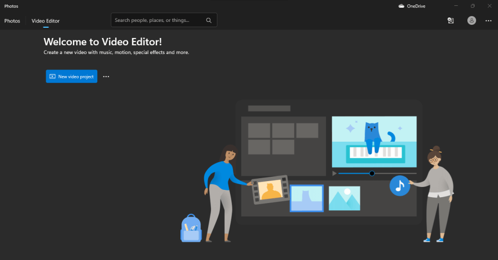
There is conflicting information online about the state of the default Photos video editor. Most articles claim that the built-in video editor has been discontinued, and with good reason – Microsoft has introduced Clipchamp into the Windows app ecosystem to act as the video editor instead.
But if you have the latest version of Windows and fire up the app, you will find that the Video Editor tab is there and very much still working. So while it is possible that the feature will be eventually phased out, for now, it is possible to use the Photos video editor for making changes to the videos on your Windows computer.
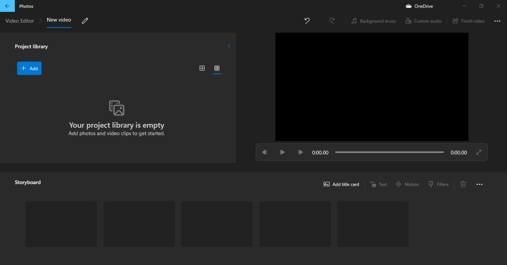
Its performance is also pretty good, at least for minor editing tasks like removing/adding audio or trimming videos. You can always use Clipchamp as well since it comes bundled with Windows as well.
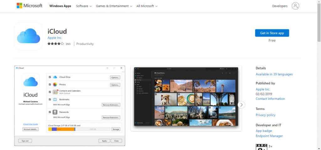
Cloud IntegrationThe new Photos app brings cloud integration with iCloud as well as OneDrive, letting you make it your photos hub both for your Windows and Apply ecosystems. This means you can finally view the photos you click on your iPhone without having to manually transfer them to your computer.
To do this, you will need to install iCloud for Windows from the official Microsoft Store. By default, only the OneDrive option is available in the Photos app.
You can import not just photos from your Cloud storage but also entire external drives pretty easily. This is a lifesaver for anyone with a lot of photos collected over the years in multiple drives. Just plug them in, import the pictures, and you can organize them like the others.
Is the New Photos App Worth It?People are skeptical of big changes, and with good reason – drastic UI differences can often make your favorite apps harder to use. Windows 8 tanked due to this very reason, and it seems that Microsoft has learned from its mistakes.
The new Photos app, while sporting a reinvented interface, does not ditch the features that make it work. Everything you are used to is still there in a more streamlined form.
In addition, it brings a host of new features that bring it more in line with more popular photo-viewing apps, making it unnecessary to download anything else for this purpose. You have a better gallery, and cloud support (including iCloud) apart from a built-in video editor good for basic tasks like clipping videos.